I'm Just Projecting
- Tamara

- Aug 31, 2020
- 3 min read
Should we talk about projections? Let’s talk about projections.
This is going to a short blog because there is simultaneously too much to say, and not much to say at all.

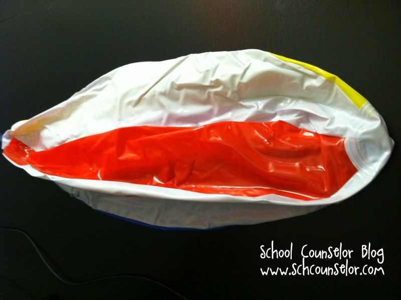
As we saw last week, I had a bit of struggle with QGIS and projections, so I wanted to take this week to talk about what that means. The world is a globe, but maps are two dimensional surfaces. How can we unfold something three dimensional, and make it flat? Imagine that you are holding a deflated beach ball, and you are given the task of laying it flat in a rectangular shape. In order to achieve that, some parts of the beach ball are going to need to be stretched. The way that you cut the beach ball will affect the ways that you can stretch it out and determines which area on the beachball has the least stretching, and therefore, the most spatial accuracy. In the image below, there are some examples of ways that the “beach ball” can be sliced: planar, conic, and cylindrical.
Where the transparent shape in the top row intersects, or is tangent to, the globe is where that projection will be most accurate (least stretched). Imagine that the transparent shape is a piece of paper wrapped around the inflated beachball. You can see that the further away the paper is from the ball, the more that area will need to be stretched in order to flatten out.

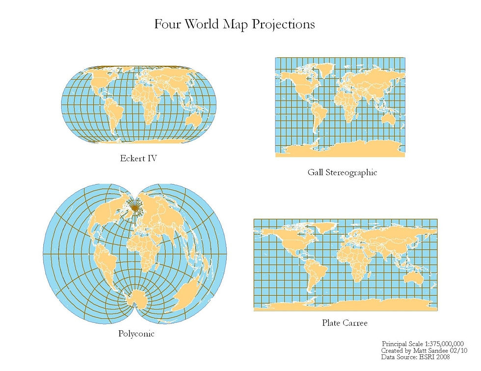
This stretching often leads to inaccuracies in parts of the world, and makes some countries seem way bigger or smaller than they actually are, or it will simply distort their shape. It is impossible to have an accurate representation of all parts of the world with one projection, but some projections are better than others. Recently, a video by Jane Elliot came out that explained how certain projections used on world maps made Eurocentric countries appear larger than those in the southern hemisphere, which may have had a subliminal affect on how people who learned about geography from those maps view the world.
For our purposes, the ultimate goal is to have a projection that accurately represents the area of interest for the map being made, which is easier for smaller study areas.
The type of projection used will determine the spatial accuracy of the location being studied, and there are lots of options. In Canada, for example, a conic projection where the “paper cone” tangent runs along the latitudinal center of the country is often best. The spatial accuracy remains fairly consistent east to west, though it should be noted that the accuracy decreases to the north and south. If the study area is single city, a planar projection that centers on that city may be used, and the spatial accuracy would decrease in all directions moving outwards from the center.
Finding what projection you need can be difficult. You can start by looking at the projection assigned to data you have downloaded, or by looking at other maps made of your study site. You can also make your own, but I’m not too familiar with that process. There is a website that lists a number of projections here.
I should note that there is a whole lot more to learn about coordinate systems and datums that I didn’t talk about today. However, it is important to remember that using projections will impact your data analysis, especially if you are measuring areas or distances. If you are using raster data, there are even more considerations, especially if you have to change from one projected coordinate system to another (which is called transformation). Spatial data will be distorted when changing projections, so it is important that these changes are made consciously by being aware of what each projection represents. Don’t stress too much though! If you always keep a copy of your raw data, and you keep track of its coordinate system and datum, then there is not much to lose by playing around with the data and seeing what projection works best for your needs.
Credit to Coursera’s free GIS course for the beach ball example. I highly recommend their videos on the types of coordinate systems, datums, and projections if you want to learn more!


Comments