Maps are the Best
- Tamara

- Jun 24, 2020
- 4 min read
Updated: Jul 7, 2020
Blog #1 – Maps are the Best
Hi! Thanks for clicking on this blog and starting your journey into the (very exciting) world of maps. My main goal here is to spark curiosity and bring your attention to the incredible potential we have for conveying information.
I’m making this blog not so much as a tutorial, but more of a peek through the window at how data is used to make visual tools like maps and infographics. Part of my goal involves the usefulness of visual information, as opposed to tables of data, and yes, even line and bar graphs. Images, photographs, icons, and other visual tools convey information so much faster than reading and processing, and personally I have always thrived with visual information, looking at things myself instead of having them described to me.
When GIS (Geographic Information Systems) was introduced to me in undergrad, something clicked. I signed up for a course, which was at 8 AM, and soaked it all up. I made it a part of the conversation when I started a project and made it a part of my independent research in my undergrad, and then my Master’s. If you ever get the opportunity to take a GIS course, I highly recommend it, it’s changed my life for the better. To get you started, check out Coursera’s free GIS course (not sponsored), which I found to be very helpful in understanding even more about GIS.
Today, however, I want to walk you through how I made the title page map of world capitals and their population size. Starting small is important, ironic given that this is a world map, but it’s easy enough to start with population size, something that everyone is familiar with.
So how does it work? Well, I was browsing my own data catalog, and I found data I had downloaded years ago from Natural Earth as part of a tutorial.
The data include spatial information and feature information, meaning that each data point is literally a point that comes with latitude and longitude information to place it on a map, and there are data associated with the point like location name and population size.
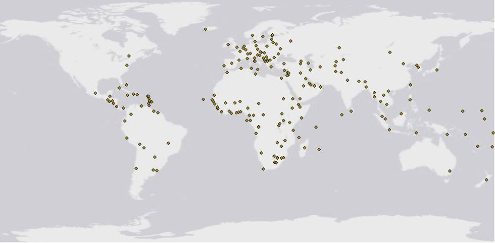
I loaded the data into ArcGIS, my program of preference for spatial work, and took a look at what we were working with.

Wow, that’s a lot of cities, and definitely not just country capitals. Conveying any kind of information from this many points is difficult, so how do we narrow it down? Taking a look at the attribute table, or the associated data for all these points, we might be able to figure out what kind of cities are being mapped here.
This is an attribute table; each row represents all the data associated with one point. I’m showing you the first seven columns of the table that gives us the name of the city (‘name’), and the class of the city (‘featurecla’, short for feature class). We can see that there are different types of classes associated with each type of capital (Admin-0, Admin-1, Admin-0 region, and so on).

The separation between Admin-0 and Admin-1 is not clearly explained on the website the data are from, however, it is fairly easy to figure out what they represent. ‘Admin-0’ capitals are country capitals, and ‘Admin-1’ or ‘Admin-0 region’ capitals are the capitals of smaller regions. There are other classes as well, but we know that we want to focus on the ‘Admin-0’ class.
From here, we can ‘Select by Attribute’ for ‘featurecla’ = ‘Admin-0’, and export all the points that meet this criterion into a whole new file:

Each data point includes population data labelled as ‘pop_max’, and this is what we can focus on next. Population data are already associated with each point, so all we have to do now is change how the points look. We can do this in the ‘Symbology’ tab, and we have a lot of options. We can represent each point using changing colours and changing shapes, and we have more options than we can cover (image source).

I selected the blue-to-red colour scheme, which is named “Prediction”, and I also chose to represent a larger population with a bigger dot, just to emphasize the point. Both symbologies are included in the legend. It took a bit of finagling to include the legends separately, but I won’t go into the details (unless you reaaally want to know… leave a comment :D)

Finally, I decided that it would help to label some of the capitals, but not all of the cities could be labelled or the map would become way too cluttered. The labels tab gives us the option to specify conditions for labelling, and so I decided (arbitrarily) to figure out which capitals had a population larger than 10 million people, and VOILA!

Of course, the final map itself requires fine tuning, like adding a title, changing the legend fonts, adding a basemap, a scale, and a north arrow (all basics covered in GIS 101…), but the hard part is over! And we have a lovely map of the world’s capitals that visually highlights population size.
There is a lot more than you can do with this data, I actually found an example online that uses this dataset in Chapter 3 of the book Learning ArcGIS for Desktop on Google books. I’m thinking of ways we could use this dataset next week… Maybe the next question we could ask is how many cities are located close to a river? We have the spatial data for populated areas, now all we need is the river data…
If you want more, please check out my twitter: @tavansta for my favourite GIF that I made for my Master’s research about phosphorus legacies in Ontario soils.


Comments